Our senior motion designer, Na, recently took a trip to China and explored the difference in design styles compared to the rest of the world. From fun cartoon-style packaging to pastel colours, there’s a clear mix of local styles and Western influence across China’s marketing.
Here are some of the cool designs she spotted while visiting home. We loved seeing the wide range of new and interesting design elements; some are fun and playful, pushing boundaries, and some are traditional and intricate.
Hear from Na:
‘I think design styles in China have changed a lot in the last few years. There are nice transitional watercolour styles that have continued into the digital world, but a lot of other cultures have got into the design world too. From cute cartoon style to super clean Swiss design style. Depending on the outcome, the design can be changed to any form.
The biggest difference is that Chinese characters can be placed vertically and horizontally, that’s something very different to English words, and it does open up more layout options in design.’
Inspiration in Action
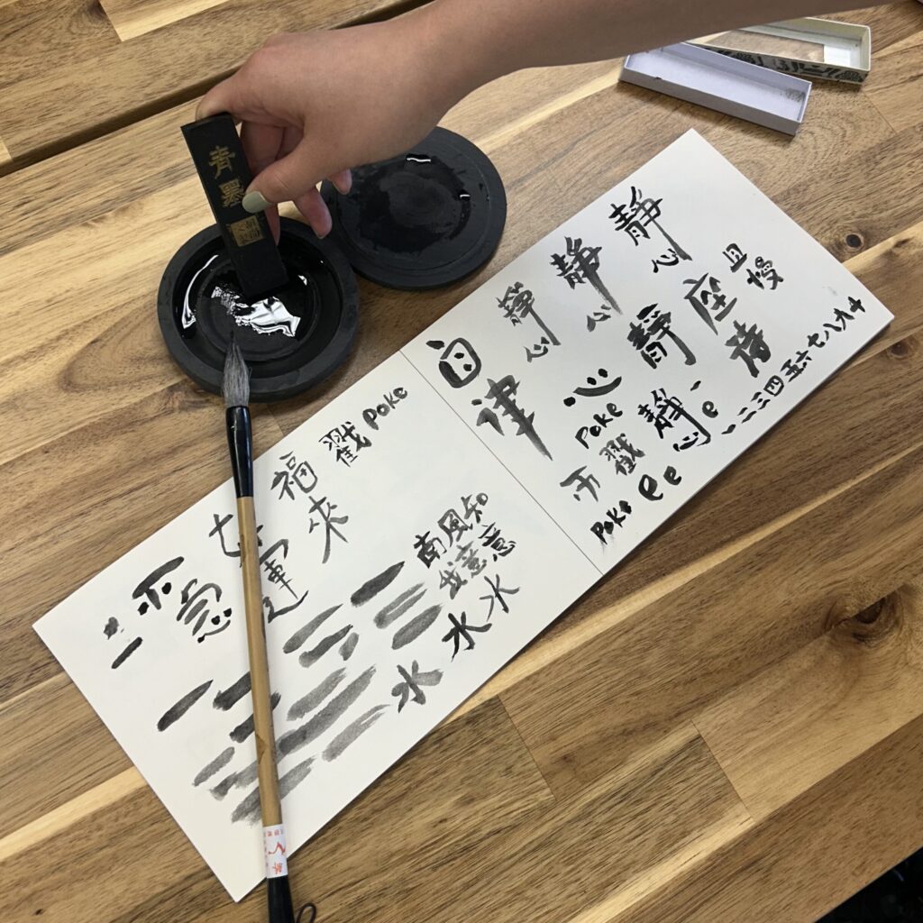
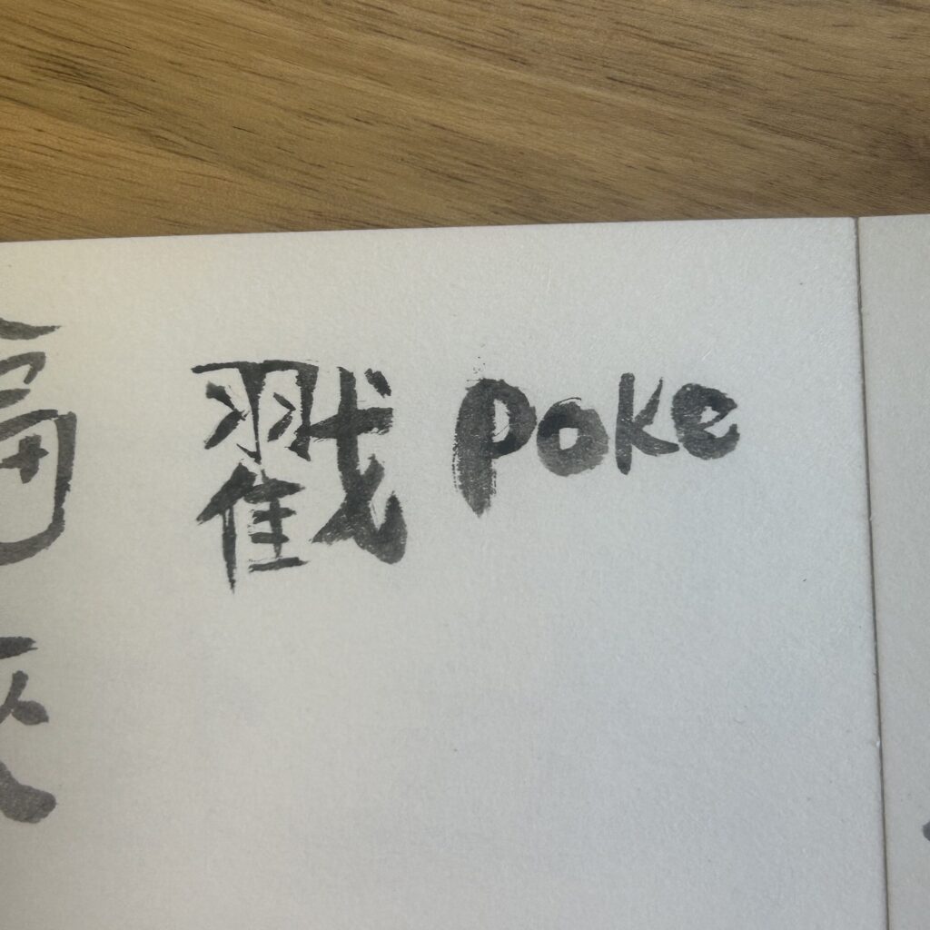
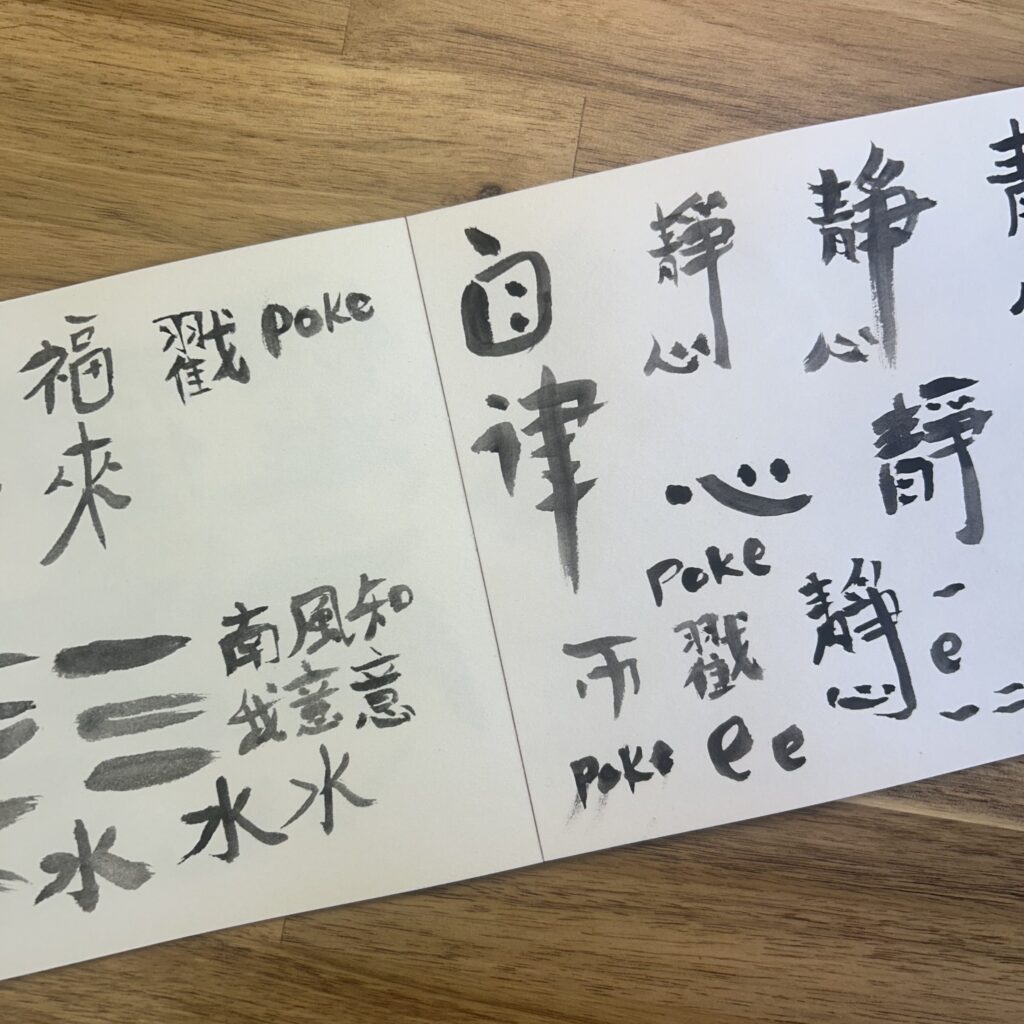
Na uses inspiration from China in lots of her design projects at Poke. Last year, she brought in a Chinese ink stone, brush, and ink block, all components of Chinese calligraphy. The process began by grinding ink on the stone, dipping the brush, and painting it onto the page. Na loves experimenting with drawing logos and even drew Poke’s in Chinese!
The ink and stone brought a unique quality to her creative process, adding a personal, handcrafted touch. Our designers always like to bring new ways of looking at design and using inspiration from other cultures helps bring this into their work.