The Active Wellbeing Society (TAWS) is a charity dedicated to developing healthy, happy communities that live active, connected lives. With a bold vision of bringing people together to create a future free from inequality, we created a brand that reflects this, translating their mission into an identity that connects every part of the organisation.
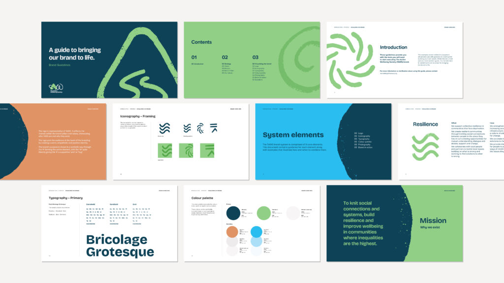
Our challenge was to then capture this in a clear, cohesive brand book that would explain the brand’s story and purpose, outline the brand’s voice and tone, provide guidance on how to visually present the brand, and show how the brand should look in action. Here’s how we built it.
Why A Brand Book Matters
First off, it’s worth explaining why a brand book matters. A brand book is a roadmap for how a brand lives and breathes.
For TAWS, it provides clarity and consistency across everything they do, whether that’s designing a poster, posting on social media, or launching a new initiative. It gives everyone the tools and confidence to communicate the brand in a way that feels true to its mission. Over time, when every touchpoint feels unified, it strengthens how people perceive and connect with the brand, building credibility and trust.
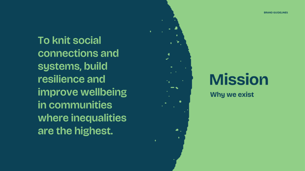
Step 1: Defining Strategy and Purpose
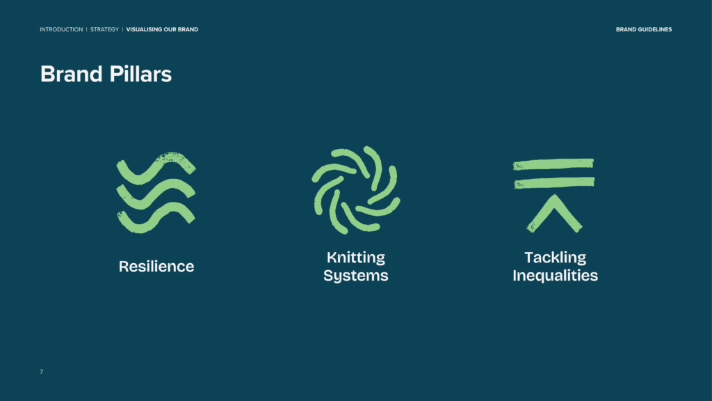
Before diving into design, we start by focusing on TAWS strategy and purpose. This section sets the tone for everything that follows, ensuring that the TAWS brand stays rooted in what matters most to them as a brand: resilience, knitting systems, and tackling inequalities.
From this foundation, we then worked with TAWS to articulate their core brand values: Open Mind, Open Heart, and Open Will. These values then guided every creative and messaging decision, shaping a brand that’s authentic, empathetic, and community focused.
Step 2: Establishing Visual Identity
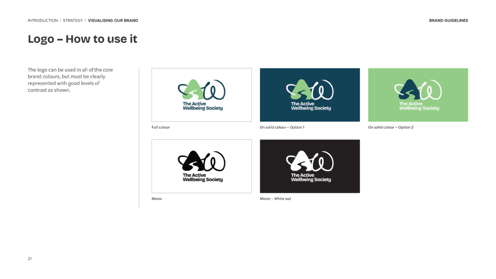
With the strategic direction in place, we moved onto visually executing the TAWS brand. Beginning with the logo and other key brandmarks, such as icons, the brand book explains when and how to use them, the available colour variations, best practices for positioning and placement, and importantly, what not to do.
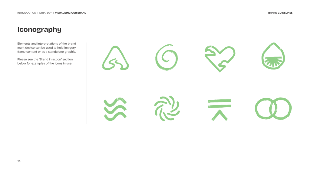
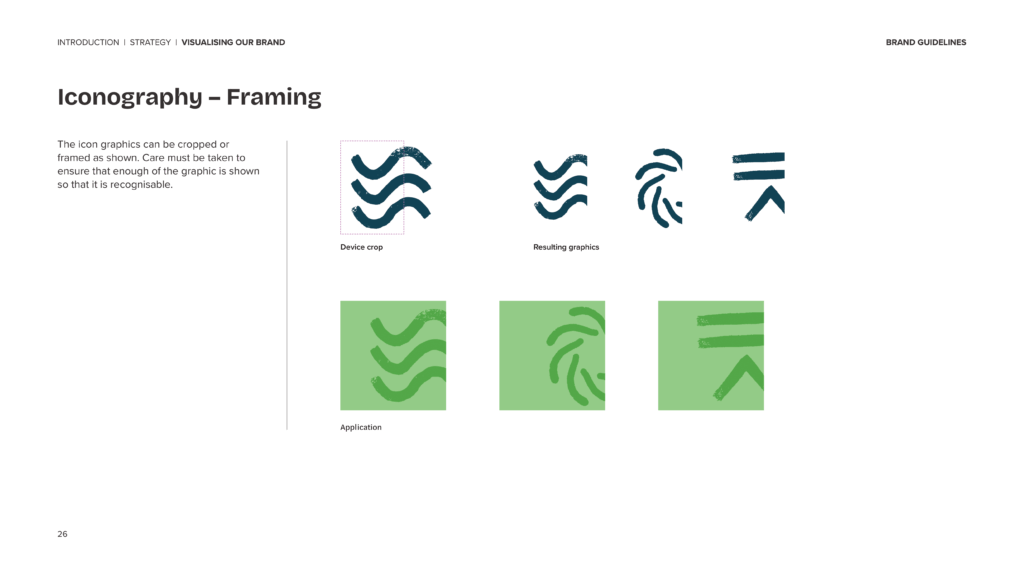
Icons play a central role in the TAWS identity. Designed to symbolise the organisation’s core pillars and values, they ensure those ideas flow consistently throughout the brand. We dedicated a section of the brand book to how these icons should be used in creative work, such as guidance on effective cropping to maintain their meaning and impact.
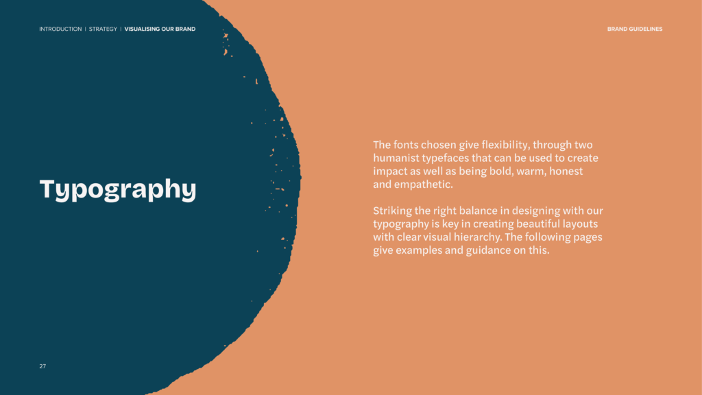
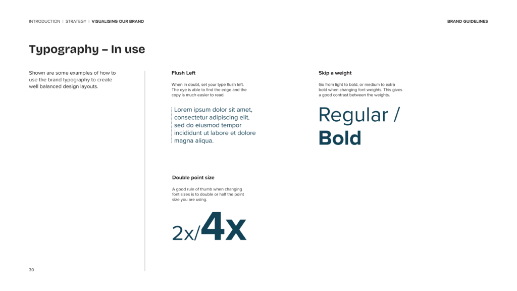
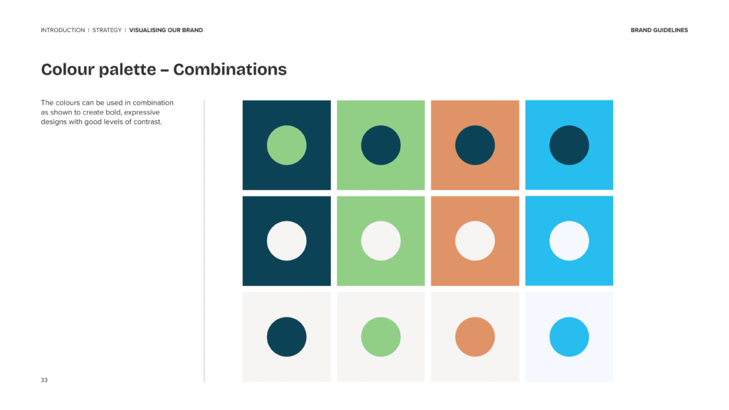
Step 3: Typography and Colour Palette
Typography and colour are crucial elements in creating a cohesive and recognisable brand identity.
In the TAWS brand book, we outlined which fonts and colours define the brand’s personality, along with clear rules on how and when to use them. This is a vital tool in maintaining consistency across all brand communications and ensuring the visual language always feels distinctly TAWS.
Step 4: Photography
Authenticity and community are at the heart of the TAWS brand, and that needed to extend beyond words and logos. As photography plays a huge role in shaping how a brand is perceived, we closed out the guidelines section of the brand book with clear art direction principles.
Here we focused on imagery that is real, positive, and relatable, capturing genuine moments within the TAWS community.
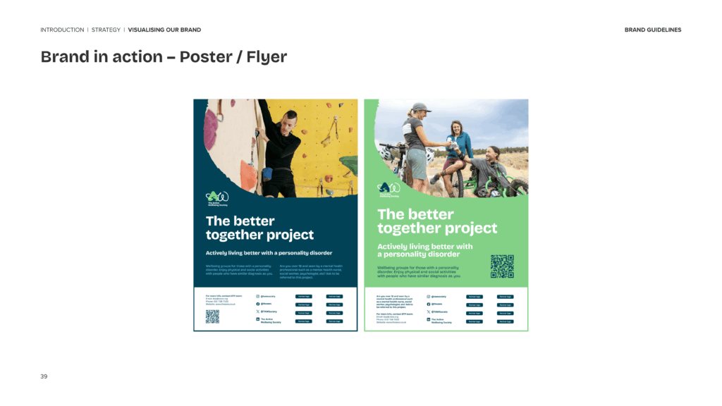
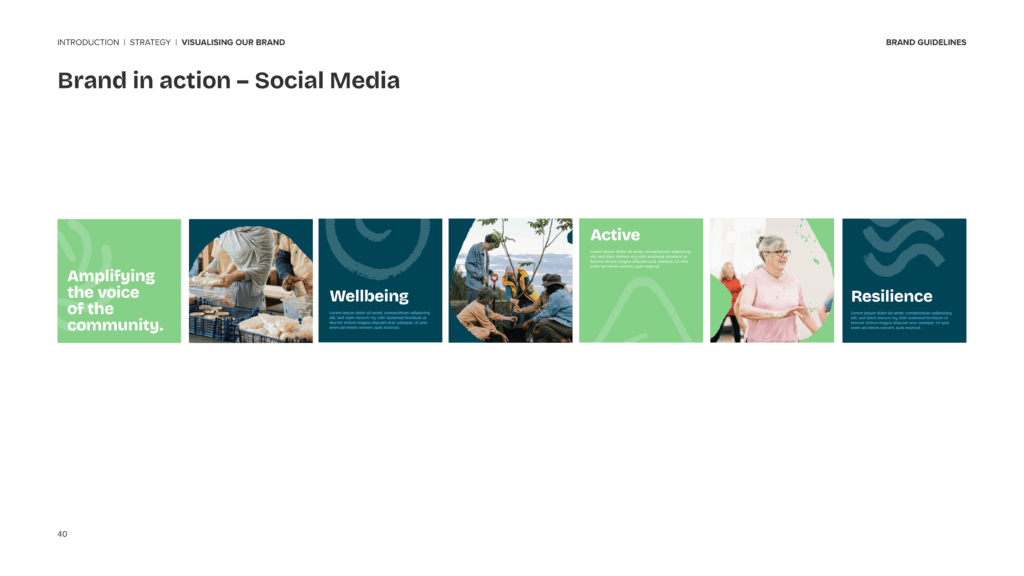
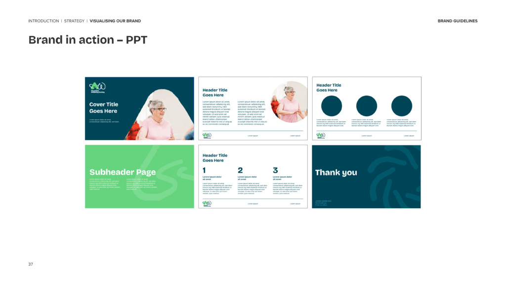
Step 5: Bringing It All Together
To round things off, we included a display of ‘proper practice’ examples, showing what the brand looks like in action when all the guidelines are adhered to. This final section serves as a benchmark for future work, ensuring that anything created for TAWS going forward can sit seamlessly alongside the existing brand.
We created a brand book that not only defines how TAWS presents itself to the world, but also acts as a practical toolkit for telling their story, key for building a strong brand community.

Think a brand book will be helpful for your brand?