The Ambition
Beechfield Brands approached us with a clear goal: to design a logo to mark their 30th anniversary. As a brand known for quality, reliability, and sustainability, they wanted a design that would reflect their rich history while signalling towards their future growth.
Sustainability and ethical business practices are core to Beechfield’s identity. As part of ‘1% for the Planet,’ they’ve long prioritised charitable giving, including funding school-building projects. They also wanted the logo to reflect their craftsmanship and close ties with embroidery partners, aligning with their slogan ‘Designed for Decoration.’ The challenge was to capture all these elements in a clean, commercially viable design that would resonate with their audience and stand the test of time.

The Impact
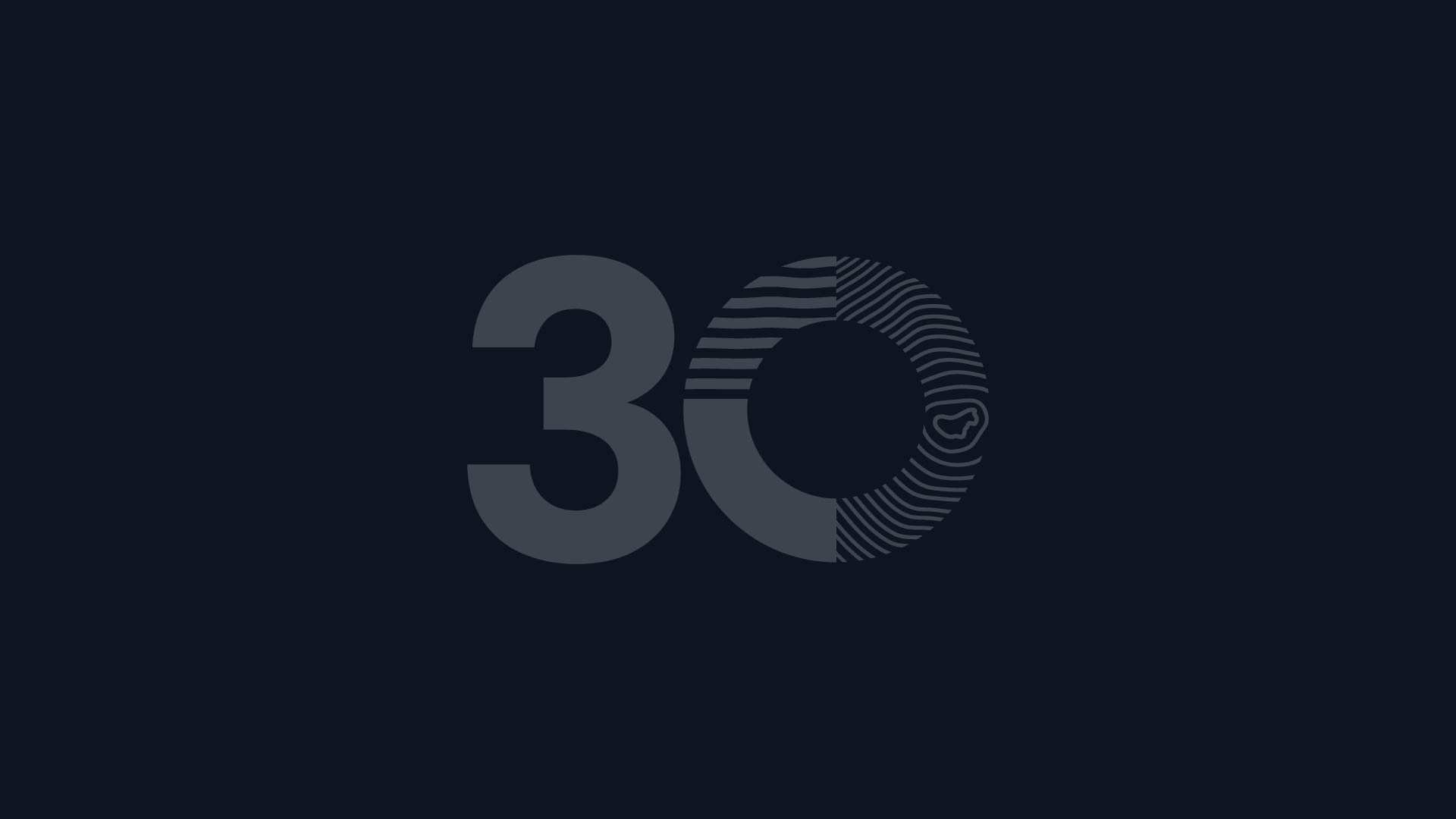
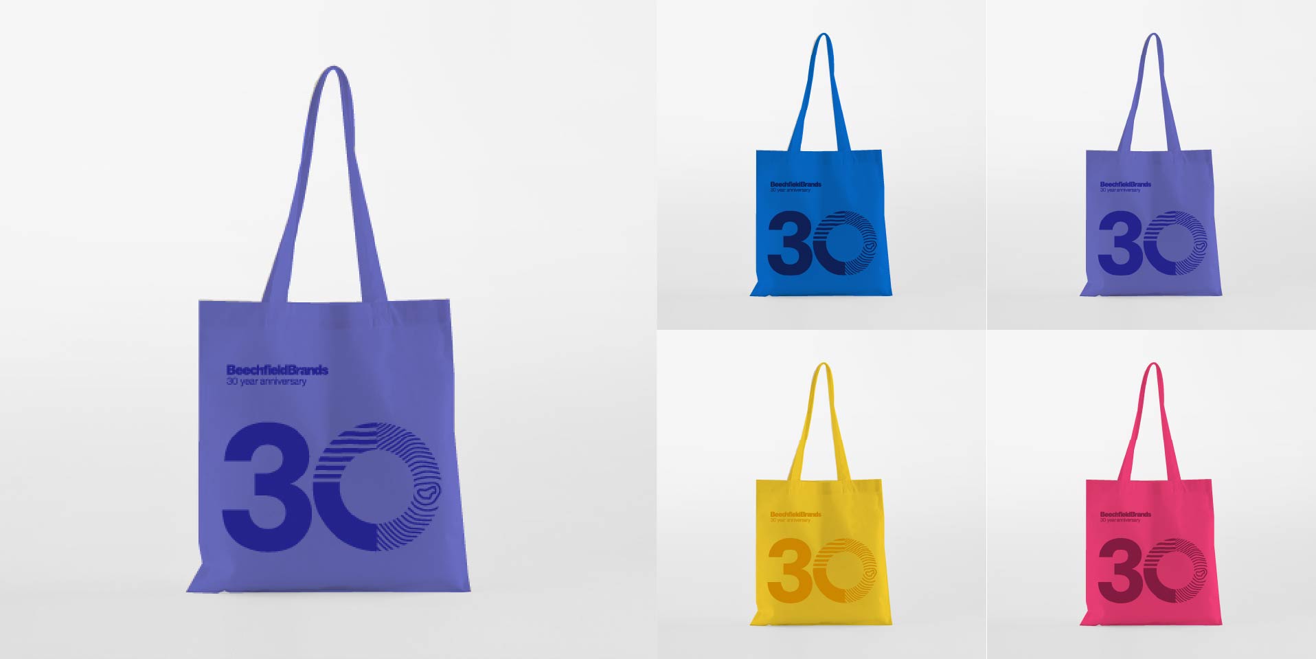
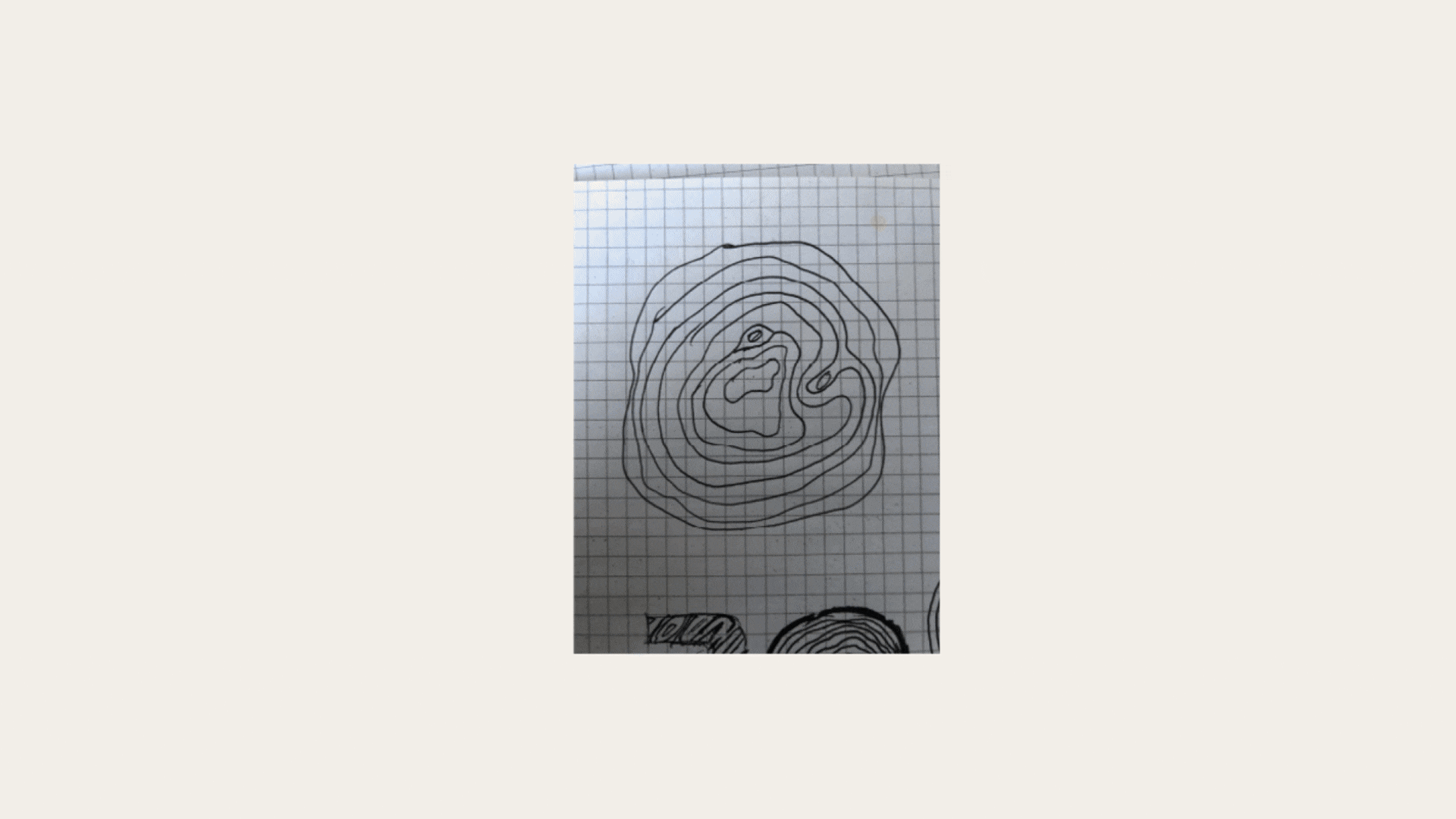
We created a logo that captures Beechfield’s heritage and modernity. The ‘0’ in ‘30’ is made up of 30 rings, representing the cross-section of a tree where each ring symbolises a year in Beechfield’s journey. This visual metaphor reflects Beechfield’s strong roots in Bury and their steady growth over the last three decades. The clean, modern design ensures versatility across products and digital platforms while maintaining a connection to the brand’s story.
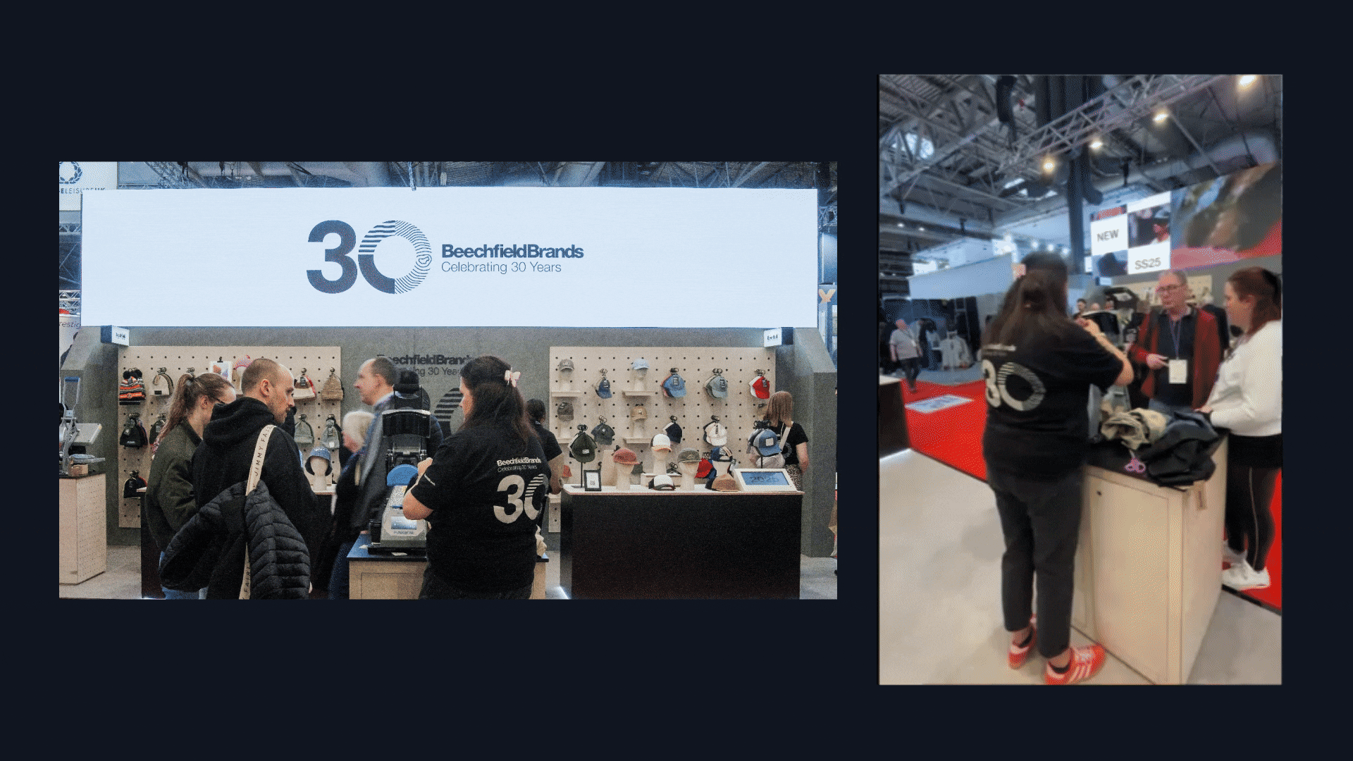
The new logo has been embraced by the Beechfield team and their customers and has been showcased at exhibitions across Europe, including France, Germany, and the UK. The design strikes the balance between tradition and modernity, positioning Beechfield as a brand with deep roots and a clear vision for the future.