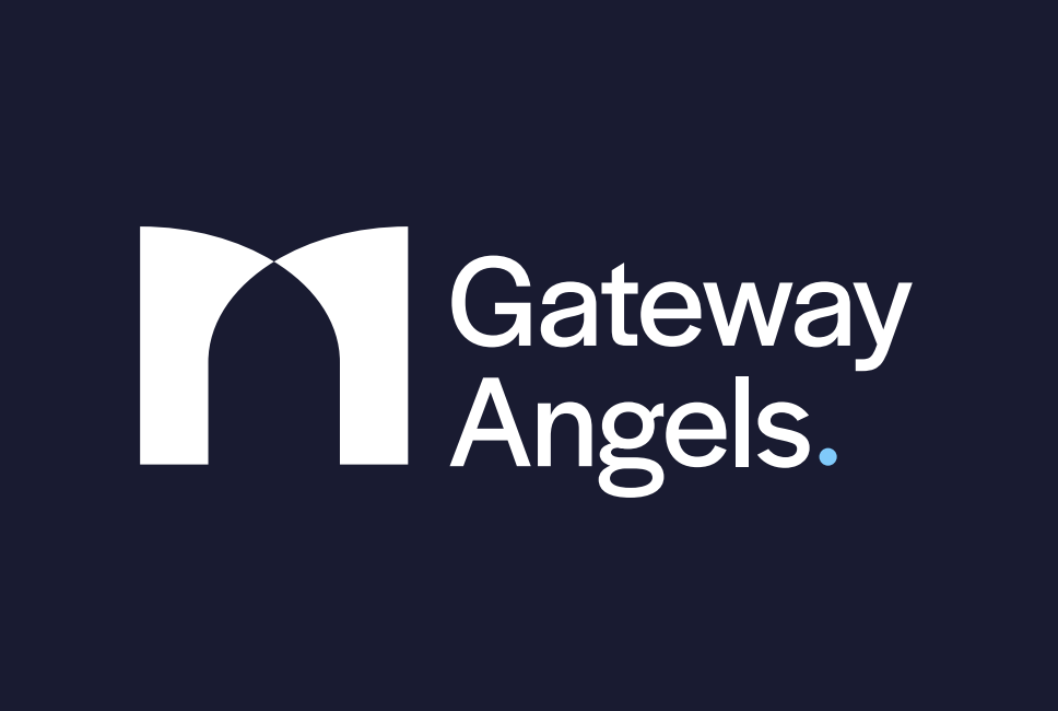
In 2024, we partnered with Gateway Angels, the first Angel Investor network for the Liverpool City Region, to create a fresh brand identity. Previously known as LCR Angel Network, they needed an identity that better reflected their mission of connecting Angel Investors with high-quality opportunities.
A key part of this rebrand was designing a clean, modern logo that symbolises growth and connection, aligning with their refreshed brand identity as Gateway Angels. Here’s how the team approached the creative challenge.
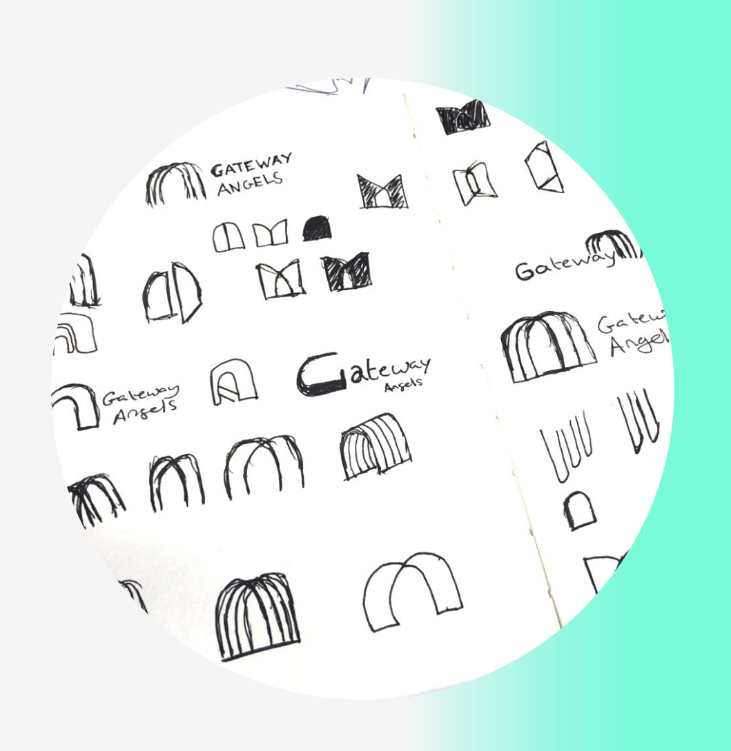
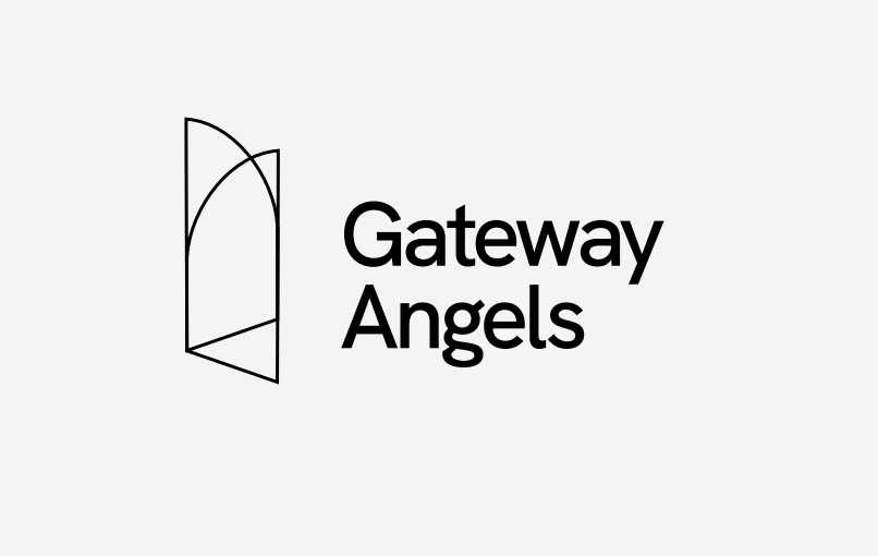
Step 1: Industry Research and Concept Development
Our process began with researching the industry and interpreting the brand’s strategy. We explored how to symbolise both a gateway and an angel in a way that visually connects their meaning. We considered how these elements could be combined into a single, cohesive graphic that reflects Gateway Angels’ mission of connecting investors with opportunities.
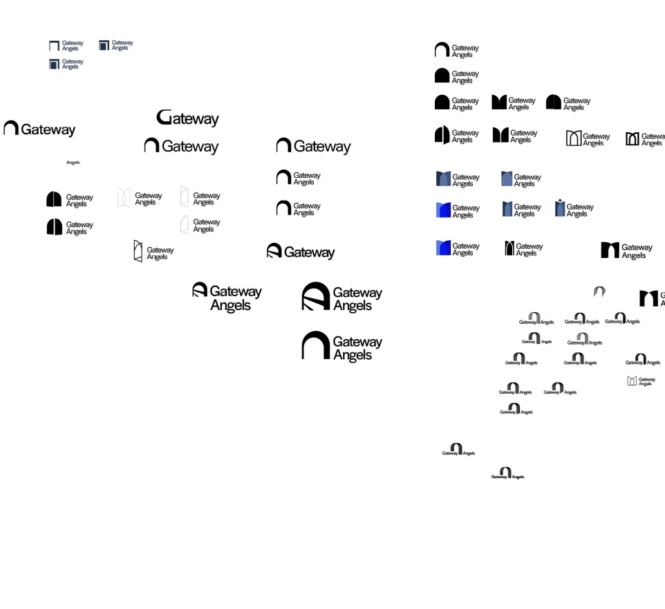
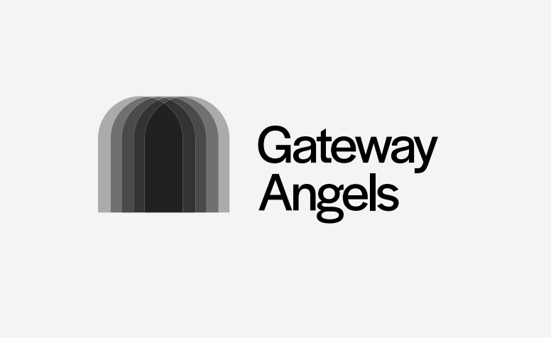
Step 2: Digital Concepts and Lock-Ups
We then recreated the concepts digitally, experimenting with different shapes, symmetry, and positioning. We tested how the symbol could sit alongside the wordmark (left, right, above, integrated, etc), refining the composition for balance and clarity.
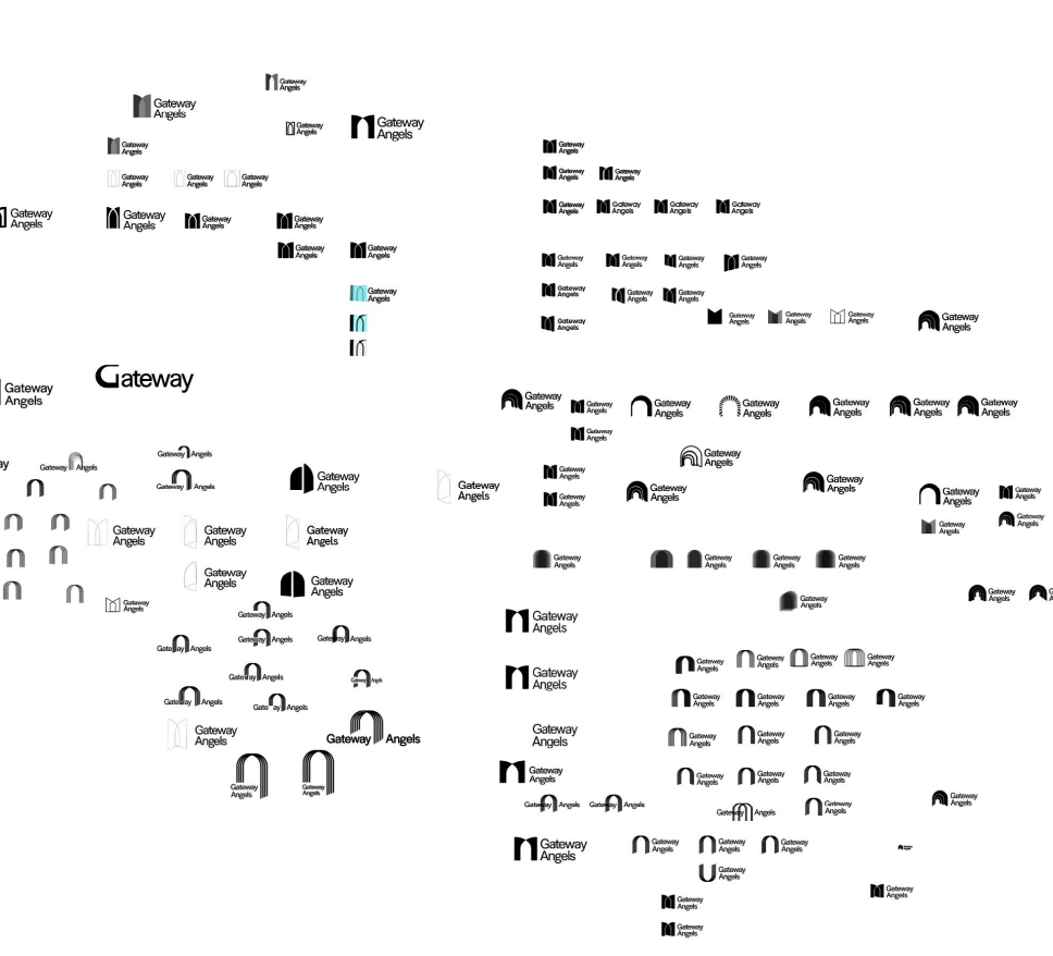
Step 3: ‘Tweak and Repeat’
Next, we made incremental adjustments, saving each version to track progress and allow for easy refinement. Once we had several promising variations, we shared them internally for team feedback.
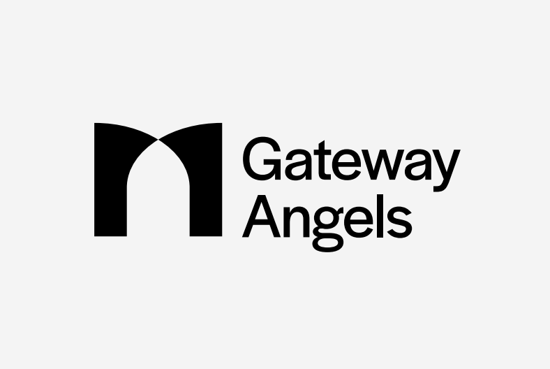
Step 4: Different Routes
From the developed options, we narrowed down to three or four logo routes to present to the client, ensuring each option reflected the core values and strategic goals of Gateway Angels.
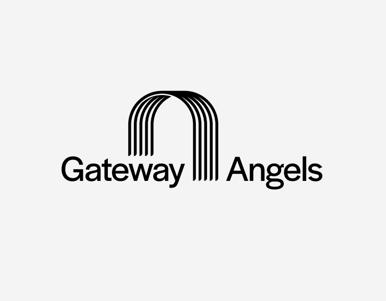
Step 5: Final Refinement
After gathering client feedback, we refined the chosen design to meet their needs, creating a modern, professional logo that captures the essence of Gateway Angels.