Pantone made its pick. But what would Poke designers choose?
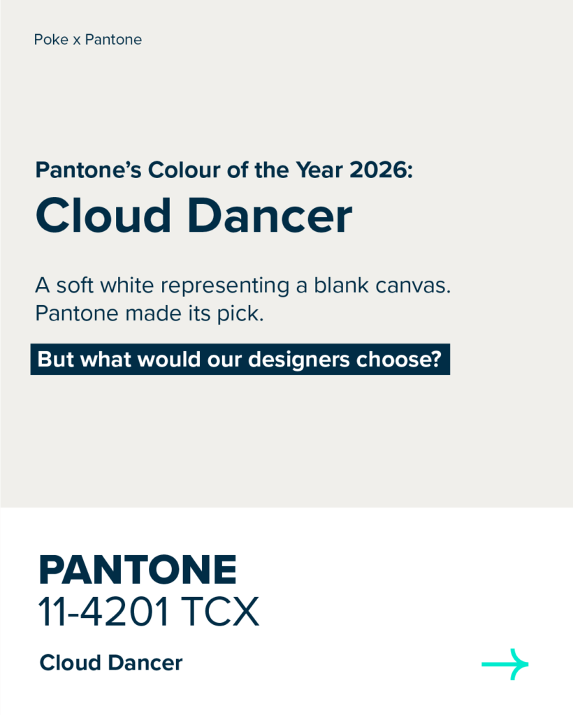
At Poke, good design isn’t about one colour. It’s about choice.
Pantone’s Colour of the Year 2026, ‘Cloud Dancer’, is described as a blank canvas. A soft off-white that creates space rather than demanding attention.
And in many ways, that makes sense. Some of our designers welcome its neutrality. Others see it as something to be used carefully, in the right context. Because colour, like design itself, is never universal.
At Poke, we don’t believe in default answers. Colour choices are shaped by purpose, audience and intent, not just by trends. So while Pantone has made its selection, we asked our designers to reflect on how ‘Cloud Dancer’ fits into their thinking, and which colours they’re drawn to right now.
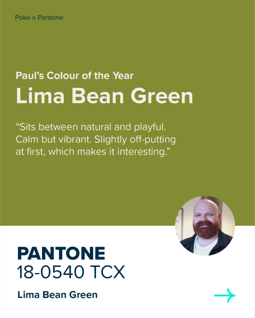
Paul Lowcock’s Colour of the Year
1) Would you love or leave ‘Cloud Dancer’ in your designs?
I’d love. It reminds me of the off-white used in those old minimal Swiss designs by Josef Müller-Brockmann and the like. All that’s missing is a nice clean grid and bit of Helvetica.
2) What would your colour of the year be?
I’m gonna say Lima Bean Green! I always end up back at some form of green and I’m currently into mossy/algae greens with yellowy undertones, that are bit off putting at first glance.
3) Where would you use your chosen colour in your designs?
I can see it as a bold statement colour.
4) Why you chose your colour instead/ what you think it represents?
I like cloud dancer, but if I was to switch it to Lima bean green I’d say it sits nicely between natural and playful, it has a calmness and a vibrancy to it. You almost can’t quite work out the vibe which makes it interesting.
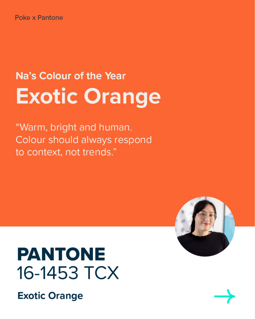
Na Yu’s Colour of the Year
1) Would you love or leave ‘Cloud Dancer’ in your designs?
I would leave it. There’s nothing wrong with the colour itself, but it really depends on the content and context of each design.
2) What would your colour of the year be?
I’ve always liked orange/peach tones, but that’s purely personal preference.
3) Where would you use your chosen colour in your designs?
I don’t think I’d limit it to specific elements like logos or fonts. It really depends on the project and its needs.
4) Why you chose your colour instead/ what you think it represents?
I like peach and orange because they give me a warm, bright feeling. However, I wouldn’t apply them to every design, colour choices should always depend on the project and what it needs to communicate.
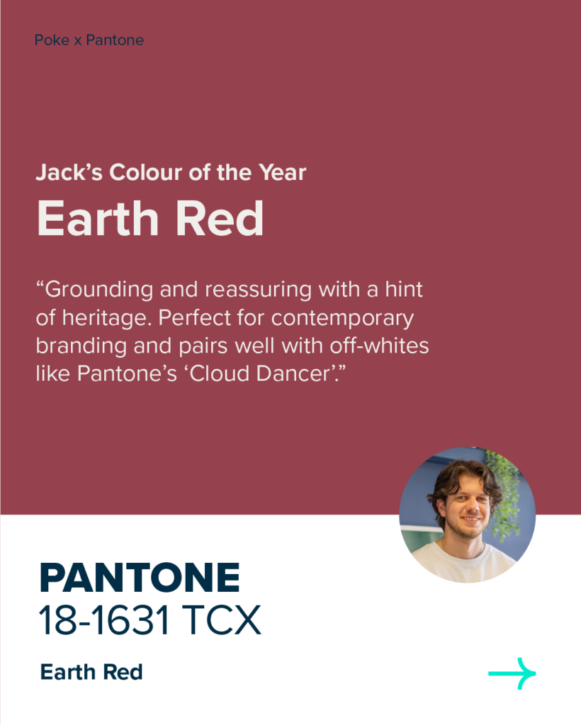
Jack Whitelegg’s Colour of the Year
1) Would you love or leave ‘Cloud Dancer’ in your designs?
Love it. It’s a nice off-white which works well across designs compared to full white as its easier on the eye, adds balance and feels more intentional.
2) What would your colour of the year be?
Earth Red.
3) Where would you use your chosen colour in your designs?
It would be nice to use this colour in a branding project, maybe a contemporary bar with its own range of drinks, something quite artsy. It feels grounding, reassuring, and has a hint of heritage without feeling old. It would pair well with ‘Cloud Dancer too’.
4) Why you chose your colour instead/ what you think it represents?
I’ve been seeing it crop up in daily life more and more and i’ve felt quite drawn to it recently. Whether it be clothes, interiors or branding. I feel like burgundy is getting a bit of a quiet resurgence, or maybe it never really went anywhere?
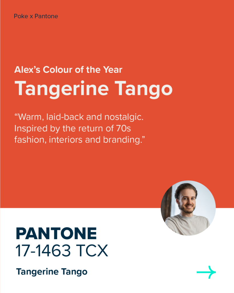
Alex Pankhurst’s Colour of the Year
1) Would you love or leave ‘Cloud Dancer’ in your designs?
Personally, I don’t mind it as I think pure white is often overused in design.
2) What would your colour of the year be?
My colour of the year would be Tangerine Tango.
3) Where would you use your chosen colour in your designs?
I’ve seen this burnt orange trend a lot online recently, especially as people seem to be reviving 70s fashion, home interior and brand identity.
4) Why you chose your colour instead/ what you think it represents?
I chose this colour as it reflects a warm and laid back feeling.
Rebecca Heywood’s Colour of the Year
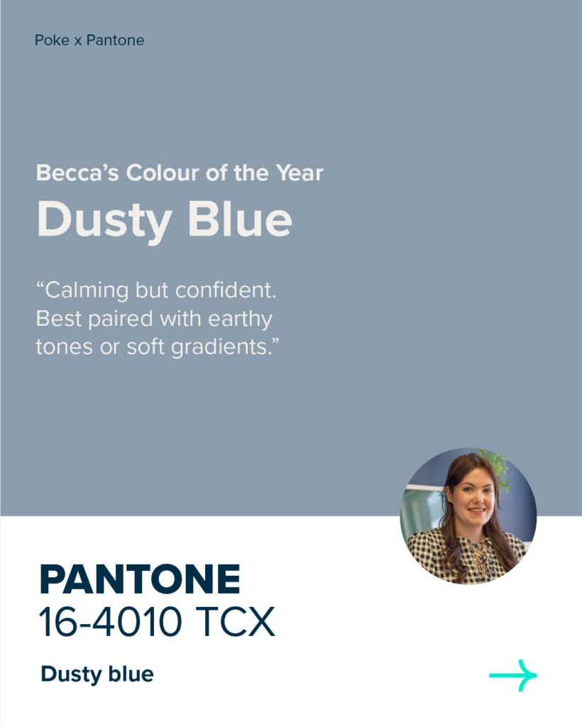
1) Would you love or leave ‘Cloud Dancer’ in your designs?
Love… but only if it’s paired with some richer colours!
2) What would your colour of the year be?
Dusty Blue.
3) Where would you use your chosen colour in your designs?
Soft moving gradients or paired with earthy colours.
4) Why you chose your colour instead/ what you think it represents?
It has a calming feel, but it still feels confident without being too shouty.
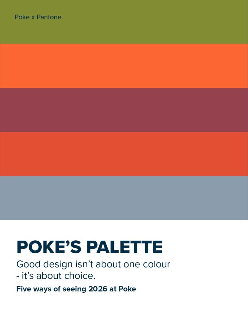
Poke’s Palette
The result is not a single alternative, but five perspectives. Five colours. And five ways of approaching design in 2026.